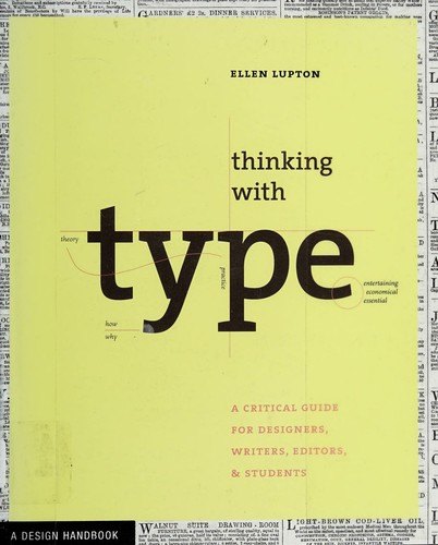
A clear, illustrated guide to using typography, from single letters to text and page layouts
A guide to typography for everyone
This compact, illustrated guide explains how letters, words and paragraphs should be chosen, sized, spaced and arranged on the page and the screen. Written by one of America's best-known design educators, it is intended not only for graphic designers but for writers, editors, students and anyone else who works with words and wants to present them well.
Who will enjoy it
Design students, graphic designers, writers, editors and anyone curious about how type works and how to use it well.
What you will get
A clear, beautifully designed introduction to typography that helps you understand and use type with confidence, whether you design pages, slides or websites.
Thinking with Type Facts: Pages, Genre and Setting
Genre
Nonfiction · Typography · Graphic design · Reference
Length
176 pages · ≈ 5 h
More about this book
The book is divided into three sections. Letter covers the anatomy of type, the history of typefaces from the earliest printed books to digital fonts, type classification, families, sizes and how to choose and combine typefaces. Text looks at how letters become words and paragraphs: kerning and tracking, line spacing, alignment, indents, hierarchy and the way readers move through a page. Grid explains how layouts are organized, from simple single-column pages to complex modular grids used in magazines and websites.
Each section opens with a short essay on history and ideas before turning to practical rules, and every principle is demonstrated with clear diagrams and examples of good and bad typography. Lupton also points out common mistakes, such as crowded lines and awkward spacing, and offers exercises that students can try. The tone is friendly and intelligent, never dogmatic, encouraging readers to understand the reasons behind conventions. Later editions were expanded with more material on screens and style sheets, but the core lessons remain the same.
Clear, elegant and useful, a modern classic of design education. About 176 pages in the Princeton Architectural Press paperback.
 Understanding Comics
 Steal Like an Artist
 Stop Stealing Sheep & Find Out How Type Works
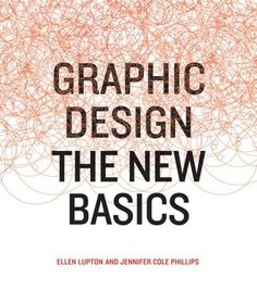 Graphic Design: The New Basics
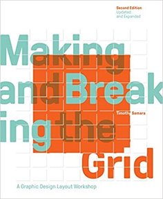 Making and Breaking the Grid
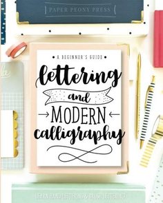 Lettering and Modern Calligraphy
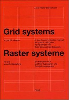 Grid Systems in Graphic Design
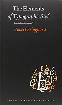 The Elements of Typographic Style
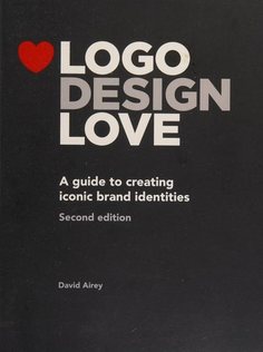 Logo Design Love
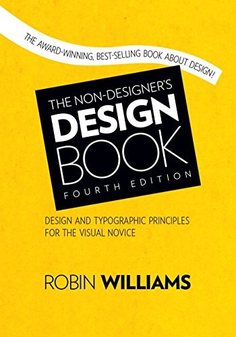 The Non-Designer's Design Book
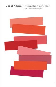 Interaction of Color