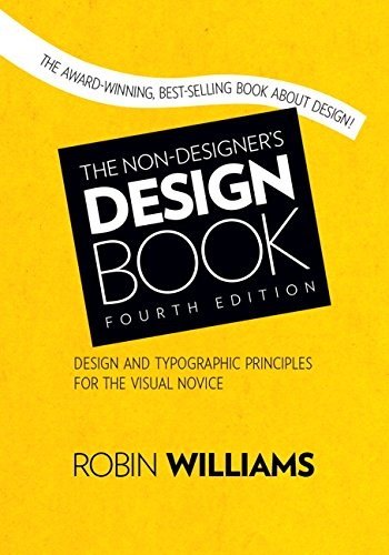
A friendly introduction to the basic principles that make any page look clear and professional
Four principles of good design
Many people need to design things without any training: a flyer, a newsletter, a résumé, a presentation or a web page. Robin Williams wrote this book for them. She explains that most good design rests on a few basic principles, and that once you can name them you begin to see them everywhere and use them in your own work.
Who will enjoy it
Beginners, students, office workers and small business owners who need to design documents, flyers or slides and want quick, practical results.
What you will get
A friendly, practical classic that teaches beginners to see and use the basic principles of good design, with clear before-and-after examples.
The Non-Designer's Design Book Facts: Pages, Genre and Setting
Genre
Nonfiction · Graphic design · Typography · Layout
Length
240 pages · ≈ 7 h
More about this book
The core of the book is four principles: proximity, grouping related items together; alignment, connecting everything on the page visually; repetition, using consistent elements to create unity; and contrast, making different things look truly different. Each chapter shows examples of poor layouts transformed by applying the principle, so the difference is easy to see.
Later chapters cover color, practical tips for designing common projects such as business cards, flyers, newsletters and brochures, and a section on typography, including how to choose and combine typefaces. Short quizzes help train the eye. The tone is warm, encouraging and free of jargon, and the book is full of colour illustrations. Experienced designers will find little new here, since the book is deliberately aimed at beginners, but it has helped many people improve their work quickly.
Clear, encouraging and genuinely useful, a long-standing favourite for anyone starting out in design. It can be read in a weekend, and its simple principles stay useful for years. The fourth edition adds a new chapter on the fundamentals of typography and updated projects to try, so it is worth choosing over older copies. About 240 pages in the fourth-edition Peachpit Press paperback.
 Thinking with Type
 Interaction of Color
 Steal Like an Artist
 Graphic Design: The New Basics
 The Elements of Typographic Style
 Logo Design Love
 Show Your Work!
 Bringing Up Bébé
 The Perfect Cookie
 Stumbling on Happiness
 Veganomicon
 Reader's Digest Fix-It-Yourself Manual