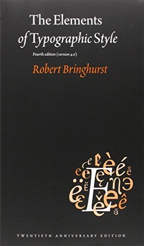
The classic guide to the craft of typography, from spacing and rhythm to page proportions and choosing typefaces
The craft of setting type
Robert Bringhurst, a Canadian poet, typographer and book designer, wrote this guide to explain how good typography works and why. His starting point is that typography exists to honour the content: its job is to help the reader, to reveal the meaning of a text and to give it a form that suits it. Everything else, from the choice of a typeface to the width of a margin, follows from that idea.
Who will enjoy it
Designers, students, writers and book lovers who want a thorough, thoughtful grounding in the principles of good typography.
What you will get
An elegant, authoritative guide to the craft of typography, combining practical rules with history and a deep respect for readers.
The Elements of Typographic Style Facts: Pages, Genre and Setting
Genre
Nonfiction · Typography · Book design · Letterforms
Length
382 pages · ≈ 11 h
More about this book
The book moves from the small to the large. Bringhurst covers rhythm and proportion, spacing between letters, words and lines, the structure of paragraphs and headings, the use of figures, small capitals and other details, and the shaping of the page itself, with a chapter on proportions drawn from music and geometry. Each rule is stated briefly, explained and illustrated, and he often notes when it is wise to break one.
Later chapters trace the history of letterforms from the Renaissance to the present, explain how to choose and combine typefaces, and survey many well-known type families. There is also guidance on setting text in many languages, and a glossary of characters and terms. The writing is precise and often poetic. Some technical sections will feel dense to beginners, and the book focuses on print, though its principles apply on screen too.
Authoritative, beautiful and rewarding, a book many designers keep within reach for their whole career. It is best read slowly, a section at a time, and returned to often. About 382 pages in the Hartley & Marks paperback, the fourth edition, version four point zero.
 Thinking with Type
 The Non-Designer's Design Book
 Stop Stealing Sheep & Find Out How Type Works
 Grid Systems in Graphic Design
 Universal Principles of Design
 Logo Design Love
 Tartine Bread
 Pedagogy of the Oppressed
 Out of the Crisis
 The Interpretation of Dreams
 Guns, Germs, and Steel