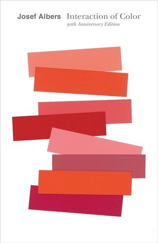
A classic hands-on study of how colors change and deceive us depending on what surrounds them
How colors really behave
Josef Albers, an artist and influential teacher at the Bauhaus and later at Yale, wrote this book to teach people to see color rather than memorize rules about it. Instead of starting with theory, he leads readers through practical exercises that reveal how colors change depending on the colors around them, and how easily our eyes are deceived.
Who will enjoy it
Artists, designers, students, photographers and anyone who works with color and wants to understand how it really behaves.
What you will get
A landmark book that trains the eye to see color with fresh attention, through simple, surprising exercises rather than rules.
Interaction of Color Facts: Pages, Genre and Setting
Genre
Nonfiction · Color theory · Art · Design
Length
208 pages · ≈ 6 h
More about this book
Albers argues that color is the most relative medium in art: the same color can look completely different against different backgrounds. Through a series of studies, he shows how one color can be made to look like two, how two different colors can be made to look the same, how colors seem to shift in lightness and temperature, and how mixtures can appear on the page that were never painted.
The exercises use sheets of colored paper rather than paint, so that colors can be compared and rearranged precisely. The text is short and direct, and the many color plates do much of the teaching. Albers developed these ideas over decades of teaching, and the book has influenced generations of painters, designers and architects. This anniversary edition includes an expanded selection of color studies. Readers looking for formulas will be disappointed, since the book's purpose is to sharpen perception through practice.
Thought-provoking and practical, a classic every designer should know. It is best read with paper and scissors at hand, since doing the exercises is what makes its lessons stick. About 208 pages in the Yale paperback.
 Thinking with Type
 Ways of Seeing
 Drawing on the Right Side of the Brain
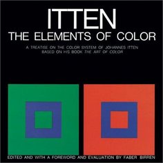 The Elements of Color
 The Non-Designer's Design Book
 Color and Light
 Understanding Exposure
 The Visual Display of Quantitative Information
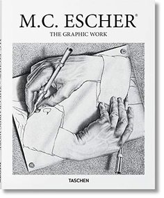 M. C. Escher: The Graphic Work
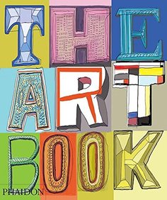 The Art Book
 Man and His Symbols
 Team of Rivals: The Political Genius of Abraham Lincoln