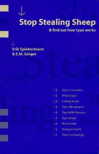
A witty, illustrated introduction to how type works, how to choose typefaces and how to use them well, written for anyone who works with words on a page or screen
Type explained with wit
Erik Spiekermann, one of the world's best-known type designers, and writer E. M. Ginger explain typography for people who are not typographers. They show how typefaces carry personality and tone, how to choose and combine them, and how spacing, line length and layout affect readability. The book uses everyday comparisons, playful layouts and many examples to make the subject approachable, and the second edition covers digital fonts and screen use.
Who will enjoy it
Designers, writers, marketers and anyone who creates documents, slides or websites and wants to understand type without a technical background.
What you will get
A witty, illustrated introduction to typography for non-specialists, explaining how typefaces work, how to choose them and how to set text well.
Stop Stealing Sheep & Find Out How Type Works Facts: Pages, Genre and Setting
Genre
Nonfiction · Typography · Typeface choice · Design basics
Length
192 pages · ≈ 6 h
More about this book
The book's great virtue is its approachability. Spiekermann and Ginger explain typography through everyday analogies, comparing typefaces to clothes, voices and personalities, and the layout itself demonstrates the principles being discussed. Readers come away understanding why some text feels easy to read and other text feels tiring. Many pages set the same text in different typefaces side by side, so readers can see for themselves how much a font changes the mood of a message.
The practical sections, on choosing typefaces for different purposes, combining them, and handling spacing and line length, are clear and useful. The title comes from a famous remark about letterspacing, and the book's playful tone makes learning the rules enjoyable rather than a chore. Terms such as kerning, leading and x-height are introduced in plain language, which makes the book a gentle way into design vocabulary for complete beginners.
The examples and font references date from the early two-thousands in the second edition, and some readers may prefer the later third edition with more up-to-date examples. Readers wanting deeper historical or technical detail should pair it with The Elements of Typographic Style. As a friendly first book on type, it is excellent. About 192 pages in the Adobe Press second edition.
 Thinking with Type
 The Elements of Typographic Style
 Graphic Design: The New Basics
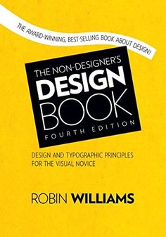 The Non-Designer's Design Book
 The Martha Manual
 How to Raise the Perfect Dog
 Organic Housekeeping
 The Dog Listener
 Bread Illustrated
 The Complete Mediterranean Cookbook
 Stumbling on Happiness
 How to Behave So Your Dog Behaves