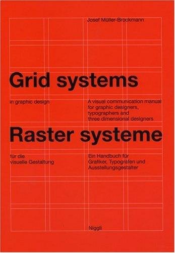
The classic manual on building and using grids for clear, orderly layouts, from a master of Swiss design
Order on the page
Josef Müller-Brockmann was one of the leading figures of the Swiss, or International, style of graphic design, known for clean layouts, sans-serif type and a disciplined use of space. In this manual he explains the grid: a framework of columns, margins and fields that helps a designer place text and images so that a page is clear, consistent and pleasing to read.
Who will enjoy it
Graphic designers, design students and anyone who lays out pages, posters or screens and wants a rigorous foundation in layout.
What you will get
A rigorous, beautifully presented manual on grid systems, showing how a clear underlying structure makes layouts orderly, readable and calm.
Grid Systems in Graphic Design Facts: Pages, Genre and Setting
Genre
Nonfiction · Graphic design · Layout · Swiss style
Length
176 pages · ≈ 5 h
More about this book
The book proceeds step by step. Müller-Brockmann begins with the purpose of the grid and the choice of type size, line length and spacing, then shows how to build grids of increasing complexity, from simple divisions to systems of eight, twenty or thirty-two fields. Each step is illustrated with precise diagrams and examples of real layouts, so readers can see how the same structure produces many different designs.
Later chapters apply the method to photographs and illustrations, to corporate identity work and to three-dimensional projects such as exhibitions. The text, printed in German and English in parallel columns, is concise and sometimes stern; the author believes that order reflects clear thinking and a responsibility to the reader. The book was written for print, but its principles underlie much of modern web and app design.
Not a light read, but a foundational one; designers often return to it for years. Pair it with Bringhurst's book on typography for a complete grounding. The large format lets the many diagrams and sample layouts be studied in detail, and the clean design of the book itself demonstrates the method. About 176 pages in the Niggli hardcover.
 The Elements of Typographic Style
 Thinking with Type
 Universal Principles of Design
 Making and Breaking the Grid
 Logo Design Love
 The Art of Fermentation
 The Pie and Pastry Bible
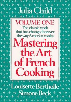 Mastering the Art of French Cooking
 Alexander Hamilton
 Memories, Dreams, Reflections
 Baking and Pastry
 Totem and Taboo