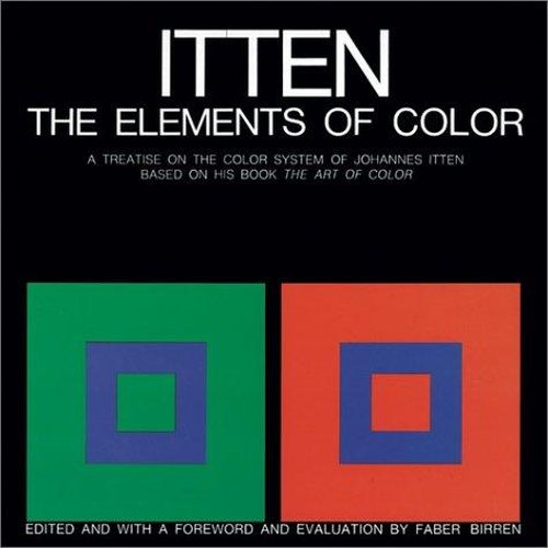
A concise version of the Bauhaus teacher's famous colour theory, built around the seven contrasts of colour
The seven contrasts
Johannes Itten, a Swiss painter and one of the most influential teachers at the Bauhaus school of art and design, spent decades studying how colours work together. His major book, The Art of Color, was a large and expensive volume. The colour expert Faber Birren condensed its essential ideas into this short, affordable book for students, painters, designers and anyone who works with colour.
Who will enjoy it
Art and design students, painters, designers and photographers who want a clear, classic foundation in colour theory.
What you will get
A concise, classic introduction to colour theory from a great Bauhaus teacher, built around harmony, the colour wheel and seven kinds of contrast.
The Elements of Color Facts: Pages, Genre and Setting
Genre
Nonfiction · Color theory · Painting · Design
Length
96 pages · ≈ 3 h
More about this book
Itten begins with the basics of colour physics and the difference between colour as a material and colour as a perception. He then introduces his twelve-part colour circle and explains how harmonious combinations can be built from it. The heart of the book is his account of seven contrasts: of hue, of light and dark, of cold and warm, of complements, simultaneous contrast, contrast of saturation and contrast of extension, or proportion.
Each contrast is explained in a few pages and illustrated with simple colour plates, often squares within squares, that show the effect clearly. Itten also discusses colour mixing, the expressive qualities of colours and the idea that each person has a personal colour palette. Some of his ideas are more poetic than scientific and are still debated, but the core lessons remain widely taught in art schools.
Short enough to read in an afternoon and rich enough to study for years. It pairs well with Albers's Interaction of Color. Keep a set of paints or coloured paper nearby; the exercises are far more convincing when you try them yourself. About 96 pages in the Wiley hardcover.
 Interaction of Color
 Color and Light
 Grid Systems in Graphic Design
 Perspective Made Easy
 The Visual Display of Quantitative Information
 The Art Book
 The Story of Art
 The Art of Being
 Light on Yoga
 The Perfect Loaf
 Creativity
 The Dry Garden