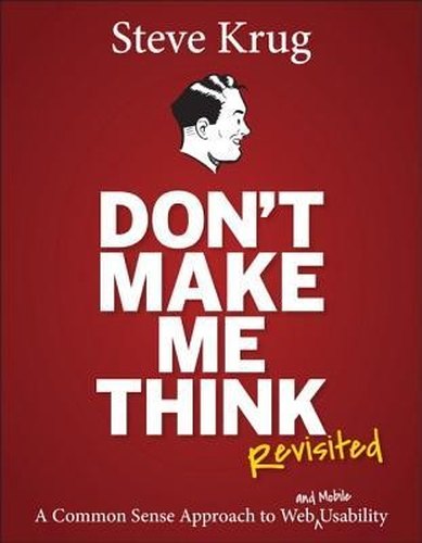
The classic, funny and short guide to making websites and apps that people can use without stopping to think
Usability in an afternoon
Steve Krug's central rule is simple: a page should be self-evident, or at least self-explanatory. Users do not read, they scan; they do not make optimal choices, they take the first reasonable option; and they rarely figure out how things work, they muddle through. This third edition of the book that has introduced so many people to usability updates the examples and adds a chapter on mobile design.
Who will enjoy it
Designers, developers, product managers, small business owners and anyone who has ever argued about what a website should look like.
What you will get
A short, funny and enormously practical guide to designing websites and mobile apps that ordinary people can understand and use at a glance.
Don't Make Me Think, Revisited Facts: Pages, Genre and Setting
Genre
Nonfiction · Web usability · UX design · User testing
Length
216 pages · ≈ 6 h
More about this book
From those principles Krug draws a handful of practical habits: design pages like billboards to be scanned, make clickable things obviously clickable, cut needless words ruthlessly, and give every page clear signposts so visitors always know where they are. His trunk test, imagining that you have been dropped onto a random page, is a quick way to check any site's navigation. He also explains why debates about what users like are usually a waste of time, and how to settle them.
The most valuable chapters cover do-it-yourself usability testing: a morning a month, three users, a simple script and an observer room. Krug shows that watching even a few people try to use your site will reveal problems you never imagined, and he explains how to fix the worst ones without overhauling everything. The book is short, full of illustrations and genuinely funny, which is rare for this subject.
Experienced UX professionals will find little that is new, and some screenshots already look dated. But as a first book, or a reminder of what matters, it remains essential. About 216 pages in the New Riders paperback.
 Show Your Work!
 Steal Like an Artist
 Python Crash Course
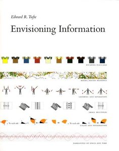 Envisioning Information
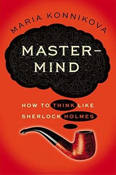 Mastermind
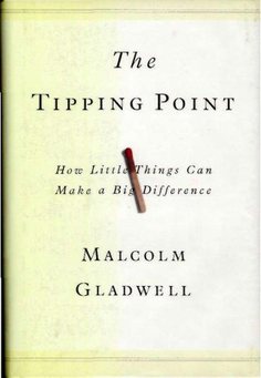 The Tipping Point
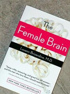 The Female Brain
 The Wisdom of Crowds
 Field Guide to Urban Gardening
 The Puppy Primer
 The Oh She Glows Cookbook